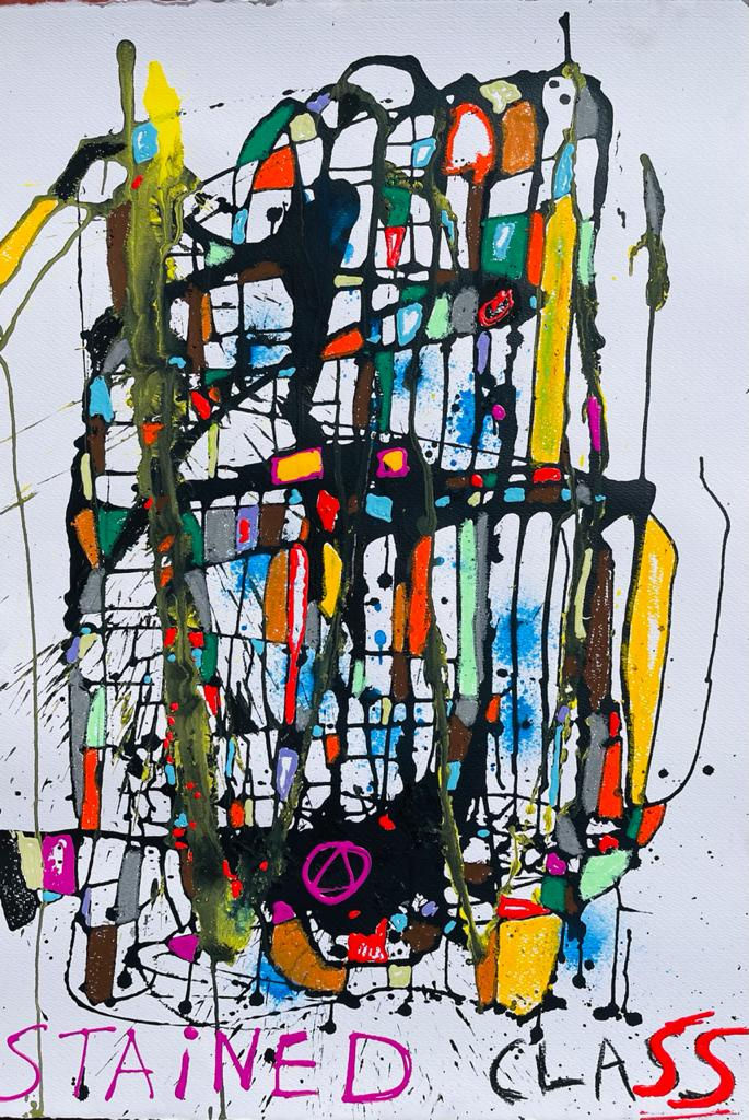
Blue Monday
- Aoife

- Jan 18, 2021
- 3 min read
With Monday 18th January being Blue Monday - the third Monday of January is awarded this dark title, due to a combination of post-Christmas blues, winter cold & dark nights, plus new years failed resolutions beginning to be realised ...A university professor researched & calculated the most depressing day of the year, using a precise formula.
However, research has also found that looking at art is good for us! It’s a fact! research conducted by the Nord-Trondelag Health Study, in Norway, surveyed a group of 130,000 Norwegians ages 13 and up. This involved questioning more than 50,000 men and women about how frequently they attended art galleries, museums or watched cultural arts movies.
Koenraad Cuypers, a key researcher at the Norwegian University of Science and Technology, the research identified a critical correlation between viewing art and wellbeing & happiness (it also demonstrated lower rates of anxiety and depression).
In fact 84% of participants in at least four art-related activities reported better wellbeing, with a total of 91% reporting increased levels of satisfaction in their lives.
The study discovered that these benefits were found both across people who created or consumed arts. Meaning that people who enjoy viewing art also benefit from exactly the same health benefits as art makers.
I'm not an academic art or psychology researcher but I'm sure that this effect must be even further amplified in these uncertain days of lockdown & restrictions. With our homes becoming not just our sanctuarys but multi facted spaces ...our gyms, yoga/dance studios, offices etc and having to share our space for longer periods with our housemates. This has led to increased spending in home decorating with two out of every five (42 per cent) of UK households planning on decorating their homes during lockdown lifts, a survey by Dulux Decorator Centre has discovered.
The interior trends are around earthier pallets, and carefully curating multi-functional spaces that suit home owners needs to cater for both work and play zones.
The pandemic has impacted on multiple interior trends, shifting away from open plan spaces with the need for zoned areas that can offer privacy & focus that is required for WFH & home schooling with ‘breakout areas’ providing the much needed space separation & relaxation. Colours which easily transcend mindsets, like beiges and ‘greiges’, are trending enabling the flow from these spaces into each another.
The Dulux Colour of the Year has recently been announced for 2021, and it's a beautiful earthy shade!
‘Brave Ground’ , is a colour shade that might once have used as an accent or feature colour, set against a minimalist white backdrop. But it's a more sedate take on the browns and aubergines that heavily featured the mood boards throughout 2020. To be honest, it’s really just a modern take on taupe!
Brave Ground heralds back to those mushroom shades that were made popular by Kelly Hoppen over 15 years ago, however currently, instead of being paired with neutrals, it's being used to work against those deeper on trend colours like a rich midnight blue and the still trending scree greys of Little Greene fame.
A natural earthy colour palette seems to be very apt for the increased desire for a fresh start to 2021.
Whilst we’re talking colour …we started with blue & whilst I have no intent to work through the entire rainbow (you’ll all be pleased to know) I can’t talk about colour without tipping my hat to the Pantone colour for 2021.
So for 2021 we are blessed with two colours! (normally there is just one Pantone colour announced) but this years annaouncement is of a marraiage of colours - PANTONE 17-5104 Ultimate Gray + PANTONE 13-0647 Illuminating,
"The union of an enduring Ultimate Grey with the vibrant yellow Illuminating expresses a message of positivity supported by fortitude. Practical and rock solid but at the same time warming & optimistic, this is a colour combination that gives os reslience & hope. We need to feel encourage & uplifted; this is essential to the human spirit" Leatrice Eiseman, Executive Director of the Pantone Colour Institute.
With all of that in mind, I thought it would be fun to bring some happy blue art into the room! Set on backgrounds of earthy ground colours & the on trend greys with colour pops of illuminating yellows sprinkled into the light
Don't be emotionally blue ...look at some beautiful art & feel the love


asda